

Font choice affects the tone and the meaning of an electronic literature piece. There are thousands of fonts out there, and each font has a different connotation, depending on your culture and print history.
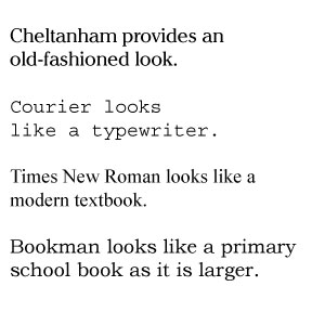
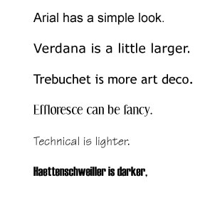
Serif fonts have a letters that have a little line (or serif) on them. These tend to be easier to read for a long time. |
Sans serif fonts, without the serif, are cleaner and often used for headers or screen reading. |
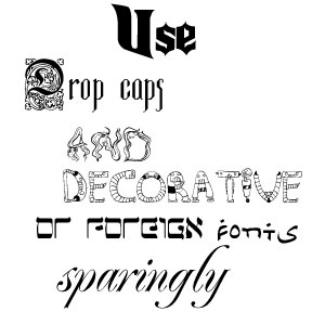
While unique fonts will carry your message, they are very strong and can be hard to read or distracting. Choose one or at most two of these to accent your text. |
 |
 |
 |

Develop fonts as part of the scheme for your elit piece. The scheme will plan out how your piece will look (font, color, and layout) and how readers interact with your piece (navigation). You could use a different font for each voice or you could use a different font to show links. Your scheme should plan for the fonts you will use for your headings, accents, link markings, and text body. These can all be the same font or they can be in the same family of fonts (different variations of the Futura font, for example) or you can use different weights of the same font (normal, bold, italic), or you can use entirely different fonts. Think about the moods and emotions you want to evoke in your readers and choose fonts to further that state. Many sites provide more information about fonts: Fontscape catagorizes fonts according to moods, Elated provides an article on getting the mood right for a website, and Design and Publishing explains how to choose a font for your purpose .
Some basic rules for developing font schemes:
You can always break the rules, but know what you are doing and why you are doing it. Show your scheme to others and see if they respond the same way you do.
For roman character languages, render the word "peace" in different fonts. Use these as headings for one of the texts below--match each heading to a text to create a mood for that text. Think about why the text matches or works with that font. You can use these fonts, which are copywritten by Nikolay Dubina. Use these only in your personal, not commercial work. To translate, cut and paste these letters from this jpg in any image manipulator. These fonts do not come with diacritical marks, so you will have to draw your own.
1. Judy cooked her mother's favorite--baked fish with lemon. She had spent the day cleaning the small apartment and everything shone in the evening sun. Her mother walked through the door, tired after a long day's work of cleaning other people's homes. They sat at the table, silent. Judy swallowed slowly and took a deep breath. "I'm leaving tomorrow morning. I have to do this." Her mother shook her head, hands to her mouth. "Don't you see, mother," Judy continued. "It's for papa. All these long years, I've known. I need to do this for papa."
2. The sun is setting as I write to you. The sunsets here are brilliant panoramas with magnificent swirls of light and color. It is breath taking until you realize that each of those particles lit by the sun used to be on the ground. A garden tended by an old man, limbs aching. A rooftop filled with flower pots--geraniums and daisies. A dusty path the children took to school.
3. William tested the microphone carefully and made eye contact with every reporter present. "We are not engaged in arms deals with either side of the conflict. We reject these insinuations completely."
4.Joey looked at his own son, now proudly adjusting the shoulders of his new army uniform. Joey couldn't say "Don't do it." He couldn't say that the loss of any life was one too many. That the ones he had killed haunted him every day, sipping phantom cups as he drank his tea, catching phantom balls as he played catch with his son. The words wouldn't form in his brain or gather at his mouth. Instead he took his son's hand and held it tight.
5. When the swallows fly, they avert their eyes.
For non-roman character languages, try the same exercise, but find five different fonts for the title word.
Get some fonts. There are many places to get fonts and font advice: Da Font, Font Garden , Abstract Fonts and 101 free fonts.
Look at the Idea Book's sample pages with different fonts conveying different moods. Think about your font choice carefully--ask a few friends what they think of your choices. What do the fonts convey to them? What is their first impression of your font, color, and layout?
Choose one of the previous exercises or something else you have done and use four different font schemes on your work. Experiment with how the schemes change the look and feel and mood of your piece.
Solitaire
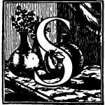
Drop caps (for letter-based languages)
a) Sense
 |
 |
 |
| Spiral, spinning, spring, supreme, sliding | Sneaking, slithering, swan, sweet odors from flowers and perfume, stealth | Shadow, swaying, scratchy, scraped |
b) Nonsense
Ideographs (for ideographic based languages
Team sports
SenseNonsense
Do the same steps 1 -5 in the Sense exercise, but substitute nonsense words or words from another language.
Share your work in person
Play the drop cap game with others. Do they get the same answers?
Read your works in a "font slam"--like a poetry slam only put the fonts up on an overhead or on a computer where they can be seen by the audience and read your works.
Share your work online